The Roar of the Design Canon…Computer Arts Projects magazine goes looking for heroes

Canons. Everyone wants to create a canon. Something that incorporates the great and the good in any given field. Or as Quentin Newark notes in What is Graphic Design? (Rotovision, 2002):
‘Literary critic Harold Bloom suggests that within a given era every artist struggles against the influence of “strong precursors”, or great artists from the past, which can exert itself across many generations. The artist has two basic strategies to deal with this; “emulation”, which can either be overt, or a rich synthesis of emulations of different precursors, and “avoidance”. The danger with avoidance is that the work becomes an exact opposite of, but still informed by, what it set out to escape from. Bloom proposes that if the new artist is strong enough, she will completely digest, rewrite, and “conquer” the language of the strong precursor and become strong and canonical in her own right – a rare event’.
He also notes that following on from studies by Martha Scotford, a North Carolina State University professor, into graphic design books, that such books generate through the filtering of designers through gender, nationality and their works… ‘a slant in one particular direction, towards excessively male, almost wholly Western European and excessively avant-garde designers’. Scotford argues that:
‘a canon creates heroes…in singling out individual designers and works, we may lose sight of the range of communications, expressions, concepts, techniques, and formats that make up the wealth of design history… for students new to the study of graphic design, a canon creates the impression that they need go no further; the best is known, the rest is not worth knowing. This is unfair, dangerous and shortsighted’.
The August 2007 issue of Computer Arts Projects magazine is a fascinating example of the creation of the canon. It contains 100 Graphic Design Icons, or as the subheading notes ‘Defining moments in Broadcast, Advertising, Packaging, Information & Print Design’. Computer Art Projects is an interesting magazine, if only because it belongs to the Future Publishing stable which over the past decade has pioneered monthly magazines in the computing, electronic goods and music areas. In that respect CAP is very typical. A format which is slightly smaller but wider than A4. Glossy presentation throughout in a style which while unlikely to win design awards is reasonably clear and an informal editorial style which permeates articles. This isn’t particularly highbrow, but then again, why should it be?
And that is what makes this issue so intriguing because in attempting to define Graphic Design Icons it tells us the nature of the canon – or more specifically a certain sort of canon. The cover is indicative of the contents, a wrap-around design in bright red with the names of various luminaries in a lighter tint. What is telling is that the concentration is on the names of individual designers, Jamie Reid, Herb Lubalin, Carolyn Davidson and so forth.
Here we have the ‘designer as hero’, the icons are significations of individuality, not of process. Here too is the emphasis on European or US based designers. There are only three women mentioned.
Inside the range of materials is fairly wide. For each area, Broadcast, Advertising, Packaging, Information & Print Design, 20 ‘greatest moments’ are selected. This selection is eclectic. So in Print Graphics at 16 we have De Stjil, while at 15 Harper’s Bazaar magazine. The Guardian newspaper design is 13 but is just behind Lou Reed’s “Set the Twilight Reeling” album cover designed by Stefan Sagmeister.

And it is here that this stratification of the canon begins to break down. Is Sagmeister’s work truly more iconic than the Guardian redesign in the late 1980s? Or than De Stjil? Indeed what are the axes that make it possible to compare and contrast a single piece of designed material and a design movement? And as we journey further through the 20 icons the questions merely proliferate. What of 11, “I shop therefore I am” by Barbara Kruger which is generally considered art. I’m delighted that it is in there at all, her work has been remarkably influential, but this introduces a further axis with little explanation as to how the reader can decode it. Are Swiss Travel Posters (5) that iconic? And what of Blue Note record sleeve design (4), The Face magazine (3), Penguin Book covers (2) and finally… Peter Saville’s ‘design classic – the seminal die-cut sleeve for New Order’s pioneering Blue Monday’? It is is true that ‘the Blue Monday sleeve is typical of his constantly changing visual aesthetic’ but that alone hardly makes it the design classic of this era.

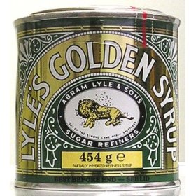
The Packaging 20 is equally idiosyncratic. At 17 there is the Lyle’s Golden Syrup tin, at 12 the supermarket carrier bag, at 10 the gatefold LP, at 7 the egg box and at 1 the Coke Bottle. But the range appears limited to what is available on the supermarket shelf. There is little in the way of experimentation, with the designed exteriors seemingly taking precedence over the actual forms of packaging used. Broadcast is revealing, particularly 10 and 11, respectively the Big Brother ‘eye’ and the CBS ‘eye’ logos. Advertising has a range of advertisements ranging from “Labour isn’t working” at 20 to “I Love New York” at 1.
Whether we need a ‘canon’ as such is a different issue. There is a natural tendency to attempt to categorise designed material in whatever medium. But my own sense is that the influences on designers are – and should be – sufficiently heterogeneous to allow them to originate in other areas of the broad visual or material culture. In that respect this attempt to define a ‘canon’ is actually almost, but not quite, as effective as one might hope. The designed material remains stubbornly page bound. Three dimensional manifestations are few and far between. New materials are generally eschewed in favour of the traditional. Political, social and economic factors are brushed over. The medium is very much the message.
That is not to say that it is without strengths. CAP intersperses the magazine with essays on graphic design, information design or product design. But to recognise, as CAP does in an essay on iPod packaging that ‘the box is an integral part of the whole package’ and then to move on from that truism to reflect upon the way in which high quality design functioned as a means of promoting Apple commercially after a lean period during the mid-1990s is to place such design within broader networks of social and economic signification that are necessary to read this sort of visual material. More of this approach would transform CAP from an interesting appraisal of an area to a near vital tool for anyone working within it.
Finally, I wonder how many designers purchase this? I have a suspicion that the numbers would be quite low and that in the main this is consumed, as it were, by students. And again, why shouldn’t it be? It is easy to quibble about the canon, but consider that the canon is very recent. Visual culture, or rather this area of visual culture, has only been codified in any structured way in the last 25 years. Philip B. Meggs is, arguably, the first to have done so. And while his History of Graphic Design has been updated and is currently in a 4th edition (2006) the pace of change has been rapid.
The attempt to generate a canon may well be inevitable, albeit a project bound to failure on each occasion. It serves as a means of making sense of and reading the field. Yet it needs to be broader and more inclusive, making connections between diverse areas of designed material and concepts. In a period where we can link conceptually and literally on the internet to a rich diversity of sources it is the only practical and sensible approach.
Ciarán Swan
About this entry
You’re currently reading “The Roar of the Design Canon…Computer Arts Projects magazine goes looking for heroes,” an entry on Design Research Group
- Published:
- August 21, 2007 / 8:28 pm
- Category:
- Design, Political Design, Popular Culture, Visual Communications, Visual Culture
- Tags:

5 Comments
Jump to comment form | comment rss [?] | trackback uri [?]